CSS
CSS is a markup language for describing the visuals of web pages. It contains numerous properties for changing how the HTML elements look - their color, size, position etc.
Add a CSS framework
To make working with CSS easier, there are CSS frameworks which have reusable solutions to common problems. In this tutorial we’ll use Pure.
Add the following code inside your HTML page’s <head> element to install Pure.
<meta name="viewport" content="width=device-width, initial-scale=1">
<link rel="stylesheet" href="https://unpkg.com/purecss@1.0.0/build/pure-min.css">
<link rel="stylesheet" href="https://unpkg.com/purecss@1.0.0/build/grids-responsive-min.css">
Note: The <meta charset="UTF-8"> element must be in the beginning of <head>, but otherwise the order of elements inside <head> doesn’t usually matter.
When you reload the page, you should see that the text has a bit nicer font.
Custom styles
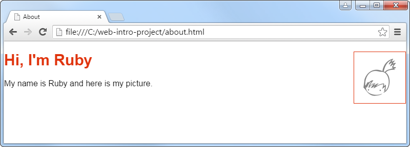
In a CSS file we can in one place change the visual style of any elements on the web site. For example we can say that all headings should be red. We can also use CSS classes to give elements descriptive names and change their style with more precision. For example there are many pictures on the web site, but only the profile picture has a red border.
To have a place where to add our own CSS, create a file style.css with the following content.
h1 {
    font-size: 30px;
    color: #E0330C;
}

.profile-picture {
    float: right;
    border: 1px solid #E0330C;
}
Add to your <head> a stylesheet link which points to that CSS file.
<link rel="stylesheet" href="style.css">
This CSS defines the visual style for the <h1> element and profile-picture class. The . in front of .profile-picture means that any element with the class="profile-picture" attribute will have this style.
Add the class="profile-picture" attribute to your <img> tag. The float: right CSS property makes the picture go to the right side of any elements that follow it. To make the picture go to the right side of your page’s heading, you will need to reorder your code so that the picture is before the heading.
Layout
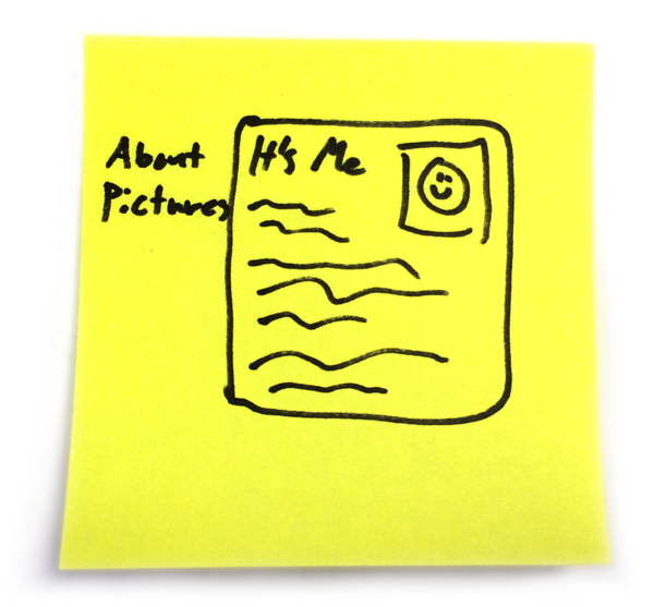
A good starting point for making a web site is to draw on paper a sketch of what you want the site to look like. Here is a sketch of a typical layout where the navigation menu is on the left and page content in the middle.
Then we can start converting that into code. We’ll start with the structure, then position the navigation and content, and finally make it all pretty.
Page structure
Here is a basic structure for a layout. Add the following elements to your page’s <body>. Put the page content you wrote earlier inside the content section where it says “page content goes here.”
<nav class="navigation">
    <ul>
        <li><a href="about.html">About</a></li>
        <li><a href="pictures.html">Pictures</a></li>
    </ul>
</nav>

<section class="content">
    page content goes here
</section>
This navigation menu is made out of an unordered list (<ul>) which contains list items (<li>) which contains links (<a> as in anchor) to the site’s pages (we’ll create the pictures page later).
The <nav> and <section> elements are just “boxes” for more content. They are similar to the <div> element (if you happen to know some HTML), but have some semantic meaning, so for example the screen readers for blind people can be smarter about where the navigation is.
Prepare for layout fiddling
To get the page layout right, it’s easier to focus on one thing at a time. We’ll first focus on just positioning the navigation and page content. Afterwards we can make them pretty.
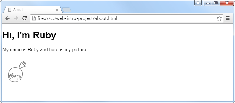
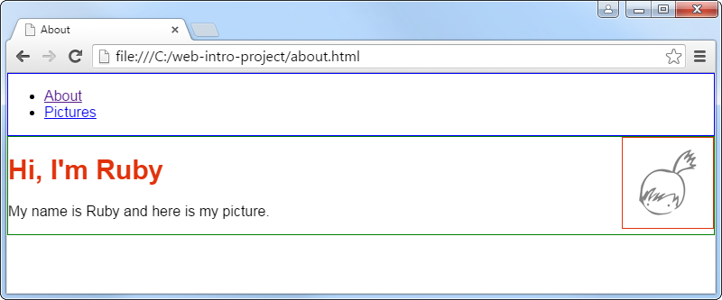
To get ready for fiddling with the positioning of layout elements, make the edges of .navigation and .content visible by adding the following CSS code to your style.css file.
.content {
    border: 1px solid Green;
}

.navigation {
    border: 1px solid Blue;
}
Position the layout elements
Most CSS frameworks have the concept of a grid for positioning elements. The basic idea is that the page is divided into rows and columns. You can then say that how many columns wide an element is. If an element does not fit to the same row as the previous element, it will go to the next row.
Here is an updated layout using Pure’s grid system and vertical menus. You can still see the familiar navigation menu and content section there, but additionally there are many Pure specific elements and CSS classes.
Replace your old layout code with this new code. Your old page content will go where it says “page content goes here.”
<div class="pure-g">
    <div class="pure-u-1 pure-u-sm-1-5">
        <nav class="navigation pure-menu">
            <ul class="pure-menu-list">
                <li class="pure-menu-item"><a class="pure-menu-link" href="about.html">About</a></li>
                <li class="pure-menu-item"><a class="pure-menu-link" href="pictures.html">Pictures</a></li>
            </ul>
        </nav>
    </div>
    <div class="pure-u-1 pure-u-sm-4-5 pure-u-md-3-5">
        <section class="content">
            page content goes here
        </section>
    </div>
</div>
Here is the updated CSS to replace your .content and .navigation styles.
.content {
    border: 1px solid Green;
    min-height: 300px;
}

.navigation {
    border: 1px solid Blue;
}

@media screen and (min-width: 35.5em) { /* same as pure-u-sm  */
    .navigation {
        margin-top: 2em;
    }
}
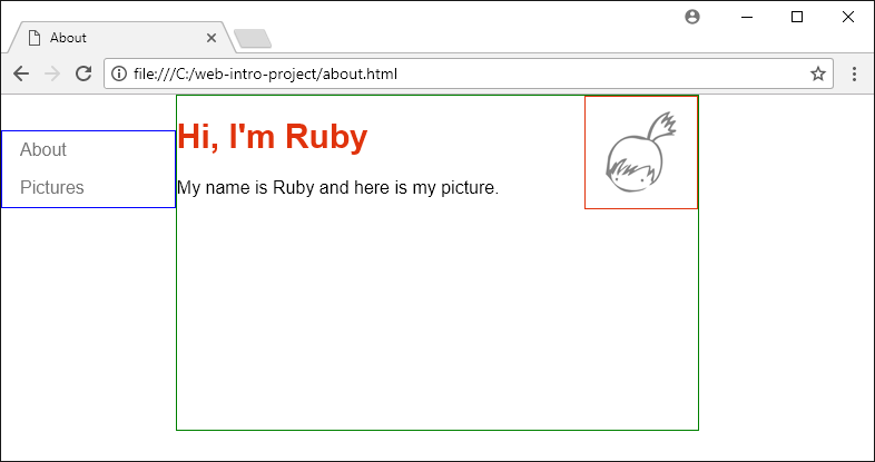
The layout should now look like this.
 *
*
This layout is responsive, which means that it will adjust itself to both big and small screens - from desktops to mobile phones. Try making your browser window narrower and see how the navigation menu will move from left to top.
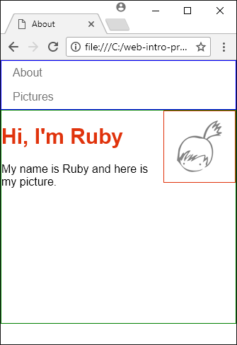
This responsiveness comes from the pure-u-* CSS classes. For example the <div> element around the navigation has two CSS classes, pure-u-1 and pure-u-sm-1-5. pure-u-1 makes it by default 1/1 wide (100% wide) and pure-u-sm-1-5 makes it 1/5 wide (20% wide) on “small” and larger screens. As a result, on mobile phones (which are “extra small”) the navigation menu is 100% wide, but on tablets (“small” or “medium”) and desktops (“large”) it’s only 20% wide and fits on the same row with the page content. If you remove pure-u-sm-1-5, it will aways be 100% wide.
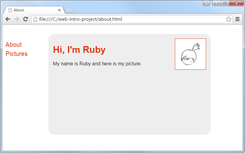
Make it pretty
After the boxes are positioned the way you like, remove the placeholder borders from .content and .navigation, and focus on their visual style. You can for example change their background, border, padding and margin (padding is empty space inside the borders, margin is empty space around the borders).
Feel free to copy the example solution as a starting point.
If you want for example rounded corners, just google “css rounded corners” for some sample code. This kind of CSS tricks are hard to make yourself; everybody just copies them from someone else. ;-)